


To Andrew Ilersich, delays and slowdowns on the TTC subway have now become the expectation, not the exception.
After mapping out a route and arriving on time to a station, he said he’d often be met with a delay that would eat into his estimated time of arrival. Then he’d hear it: someoneÌýof authority trying to speakÌýover the underground PA system, but all that could be deciphered were tinny, inaudible-crackles.Ìý
Ilersich, a 28-year-oldÌýUniversity of ÎÚÑ»´«Ã½Ìýdoctoral student in aerospace engineering, saidÌýthe consistentÌýdisruptionsÌýwhile riding the TTC finally pushed him create the independently run website,Ìý, to help others like him who were feeling marooned by subway delays.Ìý
He said his map, which is mobile friendly, provides a service the TTC does not — clear and concise real-time information that tracks where there are long-term and short-term subway delays. He said it cuts out the need for commuters to navigate what he feels is a complicated TTC website and alerts system.

“I’d gone to more than one (TTC) station over the past couple of months to find that the bus or subway I was waiting for was never going to show up and navigating (TTC’s) website was a massive pain,” said Ilersich. “The reason I built this is because the TTC announcement system is pretty terrible.”
The map is not affiliated with the TTC or the city of ÎÚÑ»´«Ã½, but wasÌý
Data for the map is automatically collected and interpreted from the notices as they are posted on the TTC website, said Ilersich.ÌýIt also includes the time of when the map was last updated.Ìý

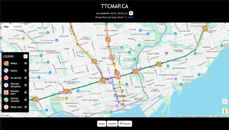
Screenshot from , a map offering live, real-time updates on subway closures, disruptions, escalator and elevator alerts and other useful information for commuters.
TTCmap.caThe map relies on icons and a legend to visualize important route information — but that wasn’t originally how he envisioned it when he first started working on the idea.Ìý
For example, the map uses the symbol of an analogue clock to display a planned disruption, a red “X”Ìýto signal no service, and a snail to warn of slower train speeds.Ìý
At first, he was planning to just highlight affected stretches of the subway in colour so a user could hover over it and the necessary information would be displayed, he said.
“But the issue I discovered very quickly is that you have lots of announcements that cover overlapping pieces of the subway lines,” said Ilersich. “And, of course, if you’re just using a highlighter, then that becomes unreadable pretty quickly.”
He switched to using icons — “and even now the icons can get a little cluttered,” he admitted.
To help riders with mobility needs, Ilersich also included accessibility notices on the map such as elevator alerts. He plans to include escalator information in the near future.
While he has a background in programming,ÌýIllersichÌýsaid this was the first time he’s dabbled in web design.
“That was a new challenge for me,” he said. “And making it hopefully look good and usable, that was something I had to do a bit of reading on.”
In total, making the map and website took aÌýfewÌýweeks, said Ilersich.Ìý

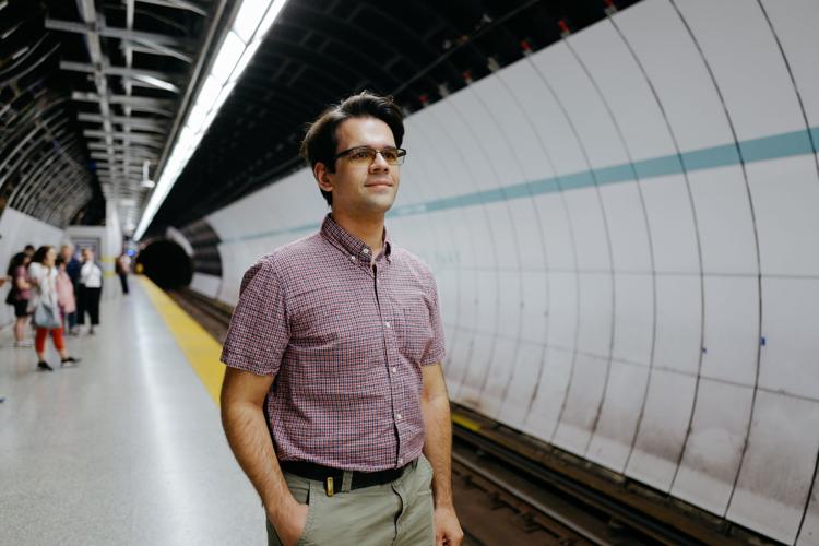
Andrew Ilersich, creator of is pictured outside the Queens Park TTC station.
Michelle Mengsu Chang ÎÚÑ»´«Ã½ StIn an emailed statement to the Star, TTC spokesperson Stuart Green said “at the Board meeting, Commissioners were impressed with what was presented,” adding the TTC haveÌý“already reached out to the creator about a possible collaboration.”Ìý
“We also continue to look at ways to improve our open data streams, allowing entrepreneurs, customers, and startups like (Ilersich) to produce great products and services to help our customers,” Green added.
However, the map remains a work in progress for Ilersich. He said he hopes to expand the map to include real-time updates on streetcar and bus delays, which he said is not currently possible.

“I think including streetcars and buses would actually be where a system like this really shines,” he said.
Currently, Ilersich said the TTC collects and presents data on streetcars and buses differently than how it does for subways, making it more difficult for his code to interpret. The notices for those modes of transportation aren’t updated as frequently as subways, too, he said.Ìý
“If at some point the TTC gives me something non-standard,” said Ilersich, citing different wording for example, “that throws a curveball into everything I had written for interpreting it.”
“I’m not full time staffÌý(that can) always be manually updating the site,”Ìýhe added.Ìý
But for now, Ilersich said his hope is that the TTC will consider endorsing the map, and perhaps even adopt it.
“I think that having a live, updating map like this that shows you the details would be a godsend for a lot of transit users,” he said.Ìý


To join the conversation set a first and last name in your user profile.
Sign in or register for free to join the Conversation